The Definitive Museum Guide to Fonts

Fonts are a defining visual element that set tone and direct the viewer’s gaze as much as color or media. Our design team has put together top eight best practices including examples of do’s and don’ts. Zoran, our lead designer, says this about fonts:

Build typography like a scientist, revise like an artist.

1. Establish a hierarchy 

Hierarchy is the typographical treatment for the different text elements on a site. A well-established hierarchy provides visual structure that makes it easier to scan, orient and navigate text. We organize hierarchy into three levels:


Level 1: Titles – this includes headers and subheaders and is the most visible typographic element in our design.


Level 2: Content – typically body content or the fonts used for the text-heavy portions of the app. This is where the bulk of content lives and so the primary concern is readability.


Level 3: Supporting Text – including captions, credit lines, button text and other elements. This supporting content can be the least visible typographic element on the page, while remaining legible.


To establish a good hierarchy, first define all the unique text elements in an app. Then apply one or more font to each element adjusting font sizes, styles, weights, color, spacing and leading. We talk more about how to adjust these variables below!

2. Pay attention to size

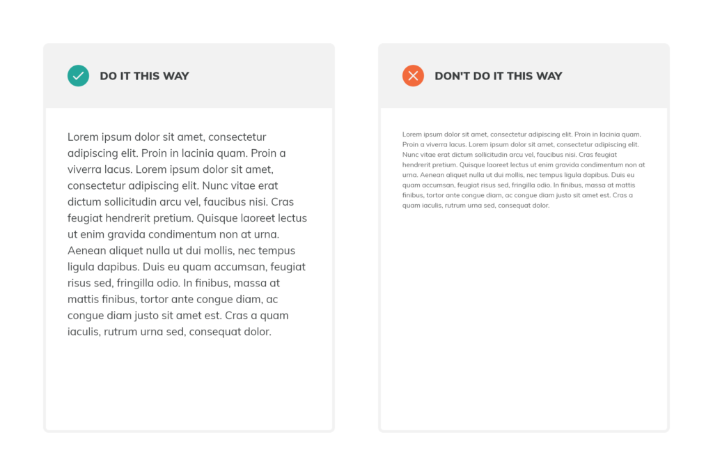
For in-gallery interactives in particular, visitors will be standing about 2-3 feet away from the content they are consuming. It’s essential that text – particularly body text – is big enough for people to read comfortably.


Pro(totype) Tip: Display on a tablet (or print out) sample text using different font sizes and ask staff and visitors to read while holding 2-3 feet from their eyes. Ask them to rate readability.


Remember that device plays an important role in readability. While you may be viewing the app on your computer, visitors will see the content on a different screens (both size and resolution). Be sure to test the font sizes and readability on the actual device.

3. To serif, or sans-serif? That is the question. 

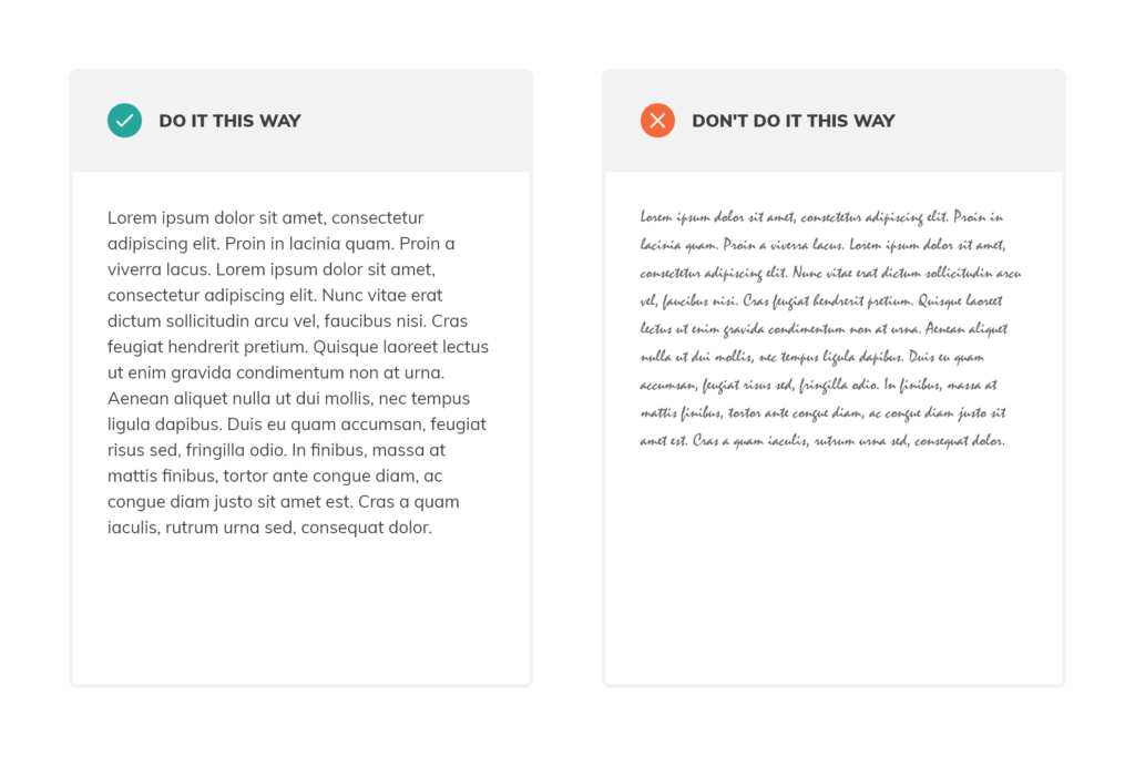
Legibility is an important factor when choosing fonts for each of the hierarchies. As a general rule sans-serif fonts (fonts with clean edges) are more legible than serif fonts.


ser·if


ˈserəf/


noun


  1. a slight projection finishing off a stroke of a letter in certain typefaces.


Level 1 (Titles) hierarchies can use any style. In general, titles are large and short which provide a good opportunity to use a serif font, if that is the desired aesthetic. Some of our favorite elegant serif title fonts are Playfair Display, Source Serif Pro, and Merriweather , while sans-serif fonts Montserrat and Poppins make a statement. You can filter by Serif and Sans Serif in Google Fonts.


Level 2 (Content) hierarchies are a bit more tricky. In general, we recommend a good sans-serif font to avoid eye straining while reading large amounts of text at a distance. Serif fonts can be used, but make sure it’s designed for readability. Fonts like Source Sans ProRobotoPT SansLatoOpen Sans and Work Sans are great choices.


For Level 3 (Supporting Text) hierarchies we recommend only using sans-serif fonts. At this level, type is likely small and therefore readability is the most important concern.

4. Limit the number of fonts

It may be tempting to include several fonts, but less variety is often more visually pleasing and readable. Mixing multiple fonts is hard to get right and the end result is usually too distracting.


When selecting fonts, feel free to start with 10 favorites that you feel are attractive, readable and align with the tone of the application and/or exhibit space. Reduce to 1-3 font choices. We typically use only one or two fonts at different sizes and weights.

Don’t be afraid to mix and match several combinations and see how they look together. If you want a ready made combination that works, go for Playfair Display and Source Sans Pro, Oswald and Open Sans or Montserrat and Cardo.

5. Give your text room

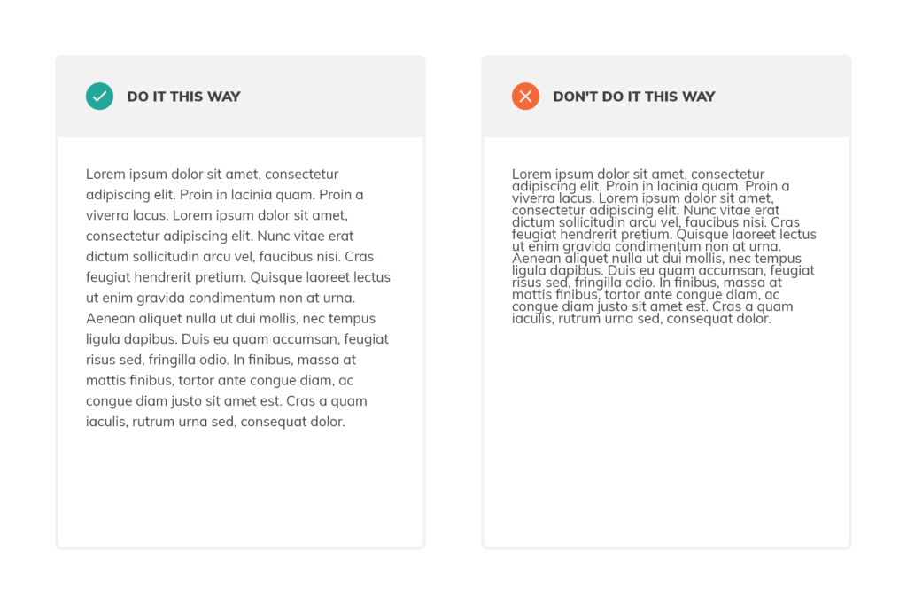
Adequate line spacing is important because it helps the eye track from one line to the next. As a general rule, serif fonts need more line spacing than sans-serif.

We often get asked what is the best line height value for ‘insert font size’? What we recommend is using a ratio of 1.2 for titles and 1.5 for everything else (font size * ratio = line height). If you are working with 16px body font size the recommended line height would be 24px (16 * 1.5 = 24).

Even though these are considered standard ratios, every font is unique and you might want to tweak these numbers for your use case.

6. Don’t shout at your users

Using all caps for Titles and some Supporting Text can be an attractive design choice. However, it’s difficult to read large chunks of text set in all caps and may be interpreted as aggressive due to bad practices in marketing spam. Use caps with caution.

7. Get aligned

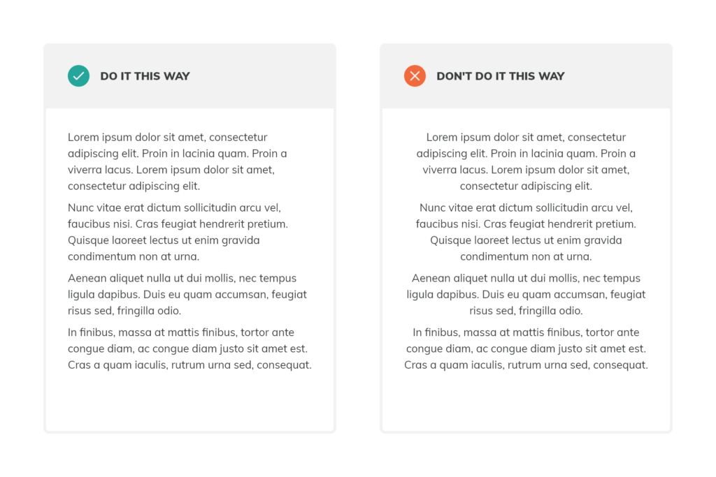
Center-aligned text, particularly for Level 2 (Content) text, is often difficult to read. Uneven text block edges interrupts our ability to read quickly or scan.

We recommend left aligned text as a standard with the use of centered text in moderation – for example, in captions or short titles.

8. Contrast is key

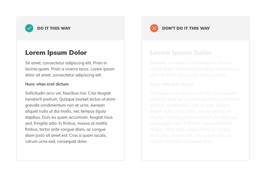
Contrast is an important factor in text readability. Low contrast between text and background forces users to strain while reading.


The visually impaired require a higher contrast level (e.g. avoid yellow text). We recommend using a tool like Online Contrast Checker to make sure the contrast of your apps meets at least WCAG 2.0 AA criteria.

Get the latest news in your mailbox with our newsletter

Select your areas of interest: