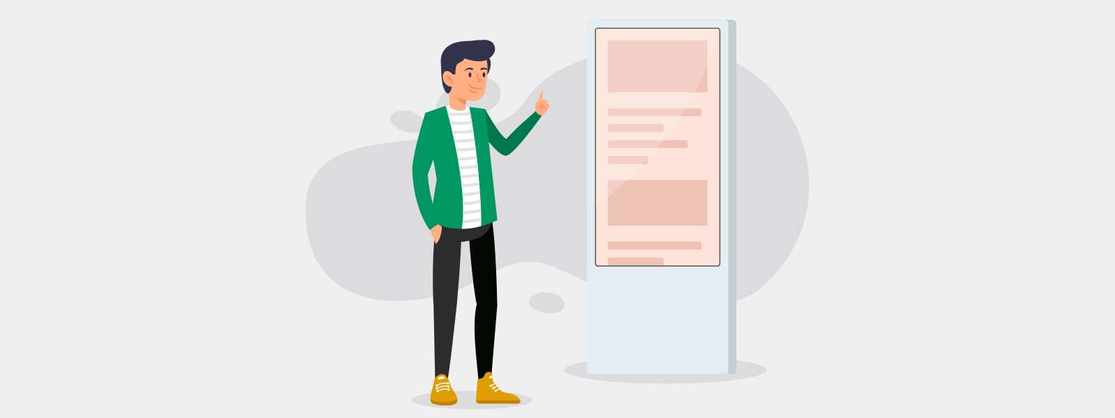
CultureConnect deploys applications across all device types from mobile phones to tablets to kiosks and large (or extra large) touchscreens. Because we use responsive design, we’re able to accommodate all devices including large touchscreens. Designing for a large touchscreen has a unique set of considerations, so we’ve put together a list of best practices and recommendations based on our experience across many installations.
HOW BIG IS BIG?
We tend to think of touchscreens in the following categories as the screen size not only implies a certain resolution but also a fundamentally different user experience in design, navigation, and physical installation.
- Mobile (Smartphones, iPods)
- Tablets and Laptops (iPad, iPad Pro, MS Surface Pro, Laptops up to 15”)
- Large (15” to 40”)
- Extra Large (40” to ~84”)
- Super Sized or Custom (extreme/non-standard aspect ratios, multiple screens etc.)
REMEMBER THE PHYSICAL EXPERIENCE
Important navigation or interpretive information should not be placed on the upper edges of the screen. While this practice makes sense on a tablet, it can prevent those out of arm’s reach from navigating through the experience or activating the interpretation. Be sure to place navigation and your high priority interpretative content within the reach of adults, children, and visitors in wheelchairs. As a general rule, the optimal area for interactivity and viewing content is 36” to 60” inches off the ground (anything above 48” may be out of reach for some children and adults in wheelchairs).

Visual perspective is also an essential, but often overlooked consideration. If the screen is quite wide, placing navigation and interpretation across the entire screen makes interaction physically taxing. Additionally, the larger the viewing area the farther away a user must stand to properly see the content. Moving back and forth farther than one to one-and-a-half arms lengths means the visitor must have to take a physical step back to see and again step forward to interact. This is another key reason why priority content should not be too high up or too far adjacent from the area of interactivity.
GESTURES (NOT WORKOUTS)
When users are engaging with a handheld device like a phone or tablet, they are able to easily tap buttons with their fingers, pinch to zoom, and rotate objects. Many of the gestures we use like swiping or scrolling are simple and require very little effort. With laptops and desktops, our gestures are controlled as well – either by a mouse or a manageable sized touchpad.
In contrast, users are often more comfortable using more of their hands or multiple fingers when using a large touchscreen. Gestures like swiping and scrolling require physical exertion if the user is required to do either movement multiple times or for long periods of time. Any gesture that forces a user to keep their arms raised will fatigue the user and therefore limit their engagement time. To that end, take care when using drag-and-drop as the primary gesture.

DON’T FORGET TO SCALE UP
Font sizes, navigational elements, and media should be scaled up appropriately. Identify the specific screen size and resolution ahead of time and user test font sizes. Our CultureConnect platform includes an App Scaling tool that allows you to create the application for any screen size – the images, fonts and placement will also automagically adjust to HD and beyond.
SIMPLIFY DESIGN ELEMENTS
As mentioned above, visitors engaging with a particularly large touchscreen may need to back up to be able to view and process the screen’s behavior or the content. It’s important then that the important information is in their line of sight and the interactivity is simple to understand.
First, let your audience know they are in front of a touch screen. Most people will not assume all large screens are interactive. Most people are more accustomed to large screens being used for television or public display screens, both of which are not interactive. A simple, “Tap to Explore” invites the visitor to engage. Video looping attract screens – even subtle animation – will also draw their attention.
Second, resist the temptation to ‘fill the space’ with more elements. Strive to simplify page design so that users are able to quickly perceive navigation elements from interpretation. Too many competing elements on a page will create confusion or make for a longer learning curve as a new user explores the app. For example, buttons should be designed to look like buttons with clear purpose. Limit the number of gestures and decisions a user must make.
OUR FAVORITE LAYOUTS FOR LARGE TOUCHSCREENS
The CultureConnect platform offers hundreds of app configurations but we have a few app themes we find particularly beneficial when designing for large screen sizes.

The Bottom Console and Timeline layouts are excellent choices for both portrait or landscape orientations. Both layouts offer persistent navigation along the bottom of the interactive, so visitors never need to reach high on the screen in order to access any interactive or interpretive components. They can also select content through image-based navigation elements for quick and easy self-guided discovery.
Get in touch to learn more about Bottom Console and Timeline layouts!
Using the recent The Polaroid Project interactive at the MIT Museum as an example, visitors can easily move to a new artwork or artist, without needing to close-out or back out of their current view. The user just selects a new entry point along the bottom and they’ve successfully navigated to a new artist and a collection of photographs.

Hotspots are also a great option as they let visitors tap on animated dots which launch interpretive content. The pulsating hotspots make for an intuitive entry point as the repetitive animation communicates the priority navigation to visitors. Once a visitor is on a content page, all navigation lives on the bottom of the screen meaning all of the important information is within arms reach.
Want to see examples of large touch screen projects? Check out a few of our articles highlighting these exceptional projects:


