The Broadest Audience
A key call to action in the discovery process was ensuring the online exhibitions could serve the broadest audience possible. Online exhibitions offered IHS an opportunity to bring their collection stories beyond the museum walls which calls for thinking about the user experience in a variety of environments early in the project to ensure best practices are consistently applied.
Broadening access manifested in three ways:
- Responsive Design
- Federal accessibility compliance
- Thoughtful design
Responsive Design
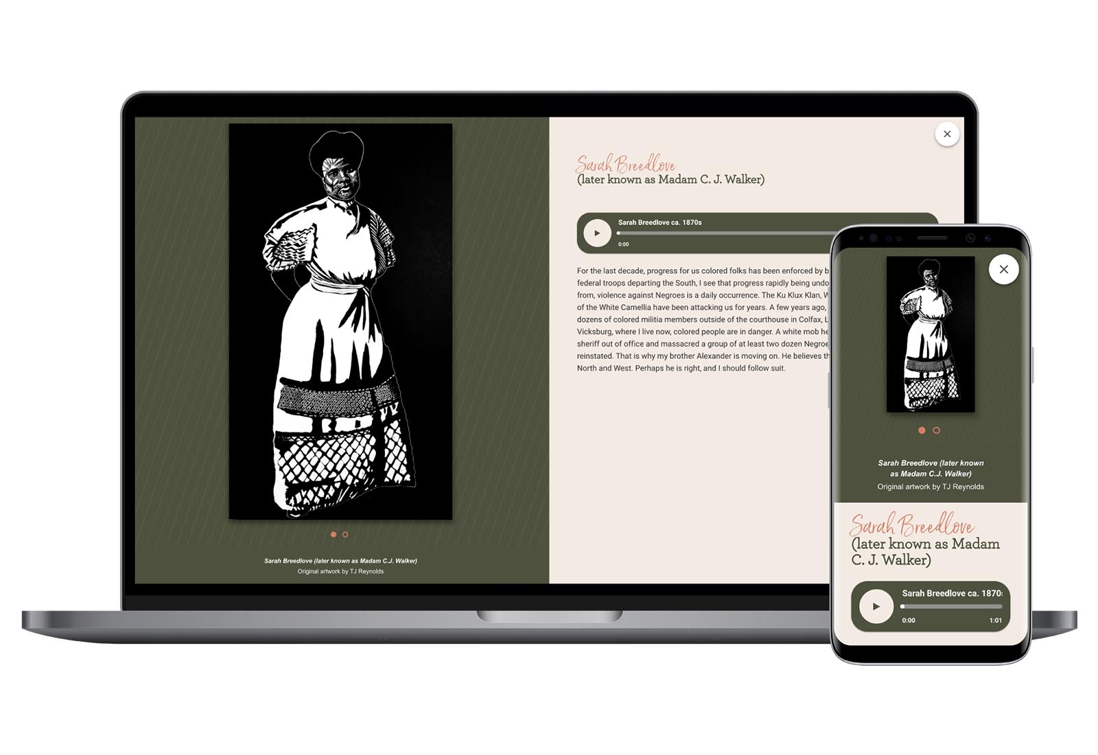
The IHS website receives traffic from audiences all over the country and those audiences access content from phones, laptops, desktops, and tablets. This meant the online exhibitions, which act as an extension of the website, need to serve audiences across those same device experiences.
CultureConnect applications are fully responsive by default but design and content structure must work within best practices for responsive design. To meet best practices, all designs were tested across a variety of devices and browsers.
- Smart Image Choices – when considering responsive design, it’s imperative that you choose images that have the ability to crop to different sizes. IHS and the design team worked together to ensure the images they selected (especially for buttons/landing pages) were large, with lots of negative space surrounding the central subject matter.
- Playful Web Fonts – One of the best ways to ensure responsive design is by utilizing web fonts. When fonts are embedded into an image, it’s not only inaccessible (more on that later), but can break/crop/decrease resolution on smaller screen sizes. IHS wasn’t afraid to choose fun, engaging web fonts for their headers which have the appearance of a highly designed display, but still respond to different device resolutions.
- Keeping the Content Front & Center –The best way to ensure a responsive design is to think of the hierarchy or importance of information. What do you want your visitors to take away from the content? If they’re skimmers, what do you hope they see first? How do you get them to keep reading, keep clicking? When we build a content strategy that prioritizes the level of information, we also design a system that follows that structure. Thinking through the content structure ensures that even visitors on the smallest of screens will still get the “need-to-know” info first.
- Make Your Design “Sing” with Gifs! – The Gennett Studio section needed to have the feeling of music, without the background noise of audio. How do you create a design that is responsive and accessible, but still wants to make you dance? Use animated gifs! Animated gifs are a wonderful way to showcase movement, and still ensure your website is accessible and responsive.
Accessibility
Like responsive design, the CultureConnect platform has accessibility features built into its digital experiences; however, the museum client team has to ensure their design and content is aligned with best practices to meet the minimum requirements. When approaching design, our design and content strategy managers always cross-check design recommendations against federal compliance.
For the museum client team, providing alt text for media is essential to build a user-friendly digital experience. The IHS team intentionally planned the delivery of alt text for all media as part of their project’s standard content delivery.
- Keeping your content “Live” – as mentioned in the previous section, one of the most important ways to ensure accessibility is by keeping all your text “live.” This means that no text (whether it’s a button, header, subtitle etc) is embedded as an image. Ensuring your text is live allows for screen readers to better flow through the site.
- If it’s not live, then make sure there’s an alternative – For any image, regardless of it containing text or not, there should exist “alternative” (or “alt”) text. Again, this allows for screen readers to describe the image. Have fun with your alt text! Alt text doesn’t (or shouldn’t be) a stale description of the literal image, but another way to tell the story. Be descriptive and emotive!
- Color Check – IHS made sure that all colors passed accessibility standards when building their application. Our designer recommends this easy and free tool to ensure your color palette is up to standard: https://toolness.github.io/accessible-color-matrix/
![]()


